Checking VBM data homogeneity
The CAT12 toolbox includes a module to assess what is called VBM data homogeneity. This post describes how to implement a much simpler but similar feature in Python.
Assessing quality on large neuroimaging datasets is a tedious task, especially combined with complex processing workflows, and as such is still an active field of research [1], aiming at making it as much automatic as possible. This relies - as is often the case with automation - on defining target values/intervals for specific metrics, or more exactly models, expected to characterize good quality against bad quality data.
In that respect, processing steps that involve brain anatomy generally require more effort to review, as interindividual variability would make it by nature harder to define absolute intervals in which image endpoints would systematically fall. Such processing steps (e.g. segmentation, normalization) are the ones that usually call for visual inspection. Some bit of automation can be added but to date it can only filter big failures, as compared to what the eye usually picks in the images to take a decision. Note that since the decision strongly depends on the subsequent analysis/study/application, the problem remains clearly ill-framed for any algorithm to be trained without more context.
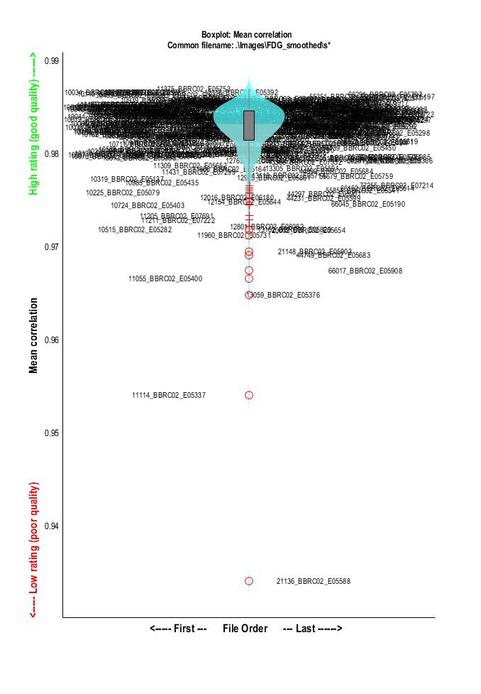
As an example of tool for controlling quality of anatomically normalized images, the CAT12 toolbox (based on SPM12) has a module for VBM data homogeneity. It provides a cross-correlation measure for each pair of images and as such facilitates the detection of outliers or normalization failures.
In order to get a similar kind of figure, the first step is to generate a mean image of the sample. This can be done easily using any tool for basic array data manipulation. The following example uses commands from FSL:
# Concatenate all images along the time axis
fslmerge -t <output> <file1 file2 .......>

# Compute the mean across time of the previously created volume
fslmaths -Tmean <input> <output>
Once we have the mean image of the sample, the second step is to collect correlation measures between each individual image and that mean image.
This can be done using the numpy.coerrcoef function as in the following code:
import numpy as np
import nibabel as nib
from glob import glob

images_fp = glob('/home/grg/data/*.nii')
mean_img_fp = '/home/grg/data/mean_FDG.nii.gz'

# load mean image and remove nans
mean_img = np.array(nib.load(mean_img_fp).dataobj)
mean_img[np.isnan(mean_img)] = 0

def calculate_cc(img_fp, mean_img):
    n = np.array(nib.load(img_fp).dataobj)
    n[np.isnan(n)] = 0
    t = np.corrcoef(n.ravel(), mean_img.ravel())
    return t[0, 1]

# calculate correlation coefficient on each image
cc = {e: calculate_cc(e, mean_img) for e in images_fp}
This returns a dictionary giving for each image a measure between 0 and 1 describing how similar the image is to the mean. As explained in the CAT12 manual, "a small overall correlation in the boxplot does not always mean that this volume is an outlier or contains an artifact. If there are no artifacts in the image and if the image quality is reasonable you don’t have to exclude this volume from the sample (...) Data with deviating values have not necessarily to be excluded from the sample, but these data should be checked more carefully."
The final step is to plot the data. The plot itself has nothing fancy (simple scatter plot), with a touch of interactiveness to get subject names displayed over the points when hovering the cursor. In a Jupyter notebook, that would look like the following code:
%matplotlib notebook
import matplotlib.pyplot as plt
import numpy as np


labels, x, y = [], [], []
for i, (k, v) in enumerate(cc.items()):
    x.append(i)
    y.append(v)
    labels.append(k)

norm = plt.Normalize(np.min(y), np.max(y))
cmap = plt.cm.RdYlGn

fig, ax = plt.subplots()
sc = plt.scatter(x,y,s=100, c=y,cmap=cmap, norm=norm)

annot = ax.annotate("", xy=(0,0), xytext=(2,2),
                    textcoords="offset points",
                    bbox=dict(boxstyle="round", fc="w"))
annot.set_visible(False)

def update_annot(ind):
    ind = ind["ind"][0]
    pos = sc.get_offsets()[ind]
    annot.xy = pos
    annot.set_text(labels[ind])
    annot.get_bbox_patch().set_facecolor(cmap(norm(y[ind])))
    annot.get_bbox_patch().set_alpha(0.4)


def hover(event):
    vis = annot.get_visible()
    if event.inaxes == ax:
        cont, ind = sc.contains(event)
        if cont:
            update_annot(ind)
            annot.set_visible(True)
            fig.canvas.draw_idle()
        else:
            if vis:
                annot.set_visible(False)
                fig.canvas.draw_idle()

fig.canvas.mpl_connect("motion_notify_event", hover)
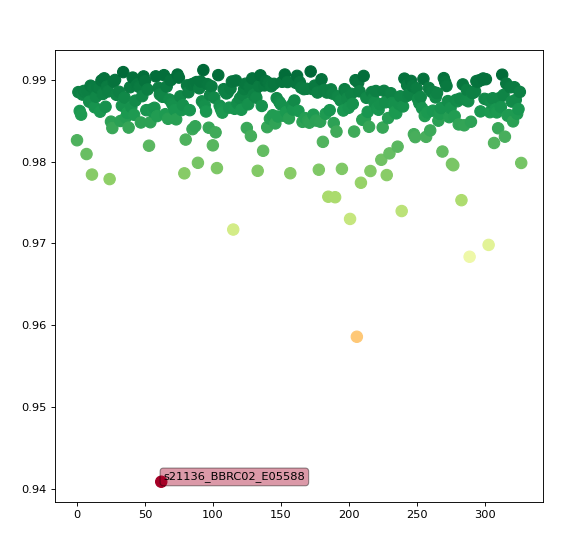
This is much simpler than what comes with CAT12 (e.g. correlation matrix across each pair of images) but is a basic working example showing how to detect outliers in a collection of spatially normalized images.
References
1.↑ J. Huguet, C. Falcon, D. Fusté, S. Girona, D. Vicente, JL Molinuevo, JD Gispert, G. Operto for the ALFA Study, Management and Quality Control of Large Neuroimaging Datasets: Developments From the Barcelonaβeta Brain Research Center, Front. in Neurosc. (2021)
Please let me know if you liked this post by clicking the button below.