ROI-based analysis in neuroimaging: a walkthrough in Python
Analyses based on Regions-of-Interest (ROIs) focus on a number of parcels with homogeneous characteristics, which are generally related to brain structures. This type of analysis is rather popular in neuroimaging especially when the study builds onto some hypothesis precisely related to some of these brain structures.
Two approaches are generally available, as two opposite ways of addressing anatomical variability.
- One way consists in warping all the subjects to a common reference space and using ROIs defined from a brain atlas.
- The other one consists in delineating ROIs individually in every subject, e.g., using segmentation algorithms. Resulting objects are likely to be closer to the individual anatomical truth, therefore improving sensitivity by focusing on the signal of interest, as compared to voxel-based methods.
ROIs are thus often defined over anatomical data and then used to filter the signal from other image modalities.
TL;DR
This post describes a basic end-to-end analysis workflow based on regions-of-interest using simulated data. It relies on typical operations e.g. extracting values, merging them with covariates, plotting, performing some linear regressions or group comparisons, which have been turned to Python code in a package called roistats.
Collecting mean values from atlas regions
In this example, we generate some maps (N=50) with some random values over an MNI brain mask. They will be like our individual (subject-level) maps.
Regions-of-interest will be defined over these simulated maps and descriptive values will be extracted from these regions. Real images may be used instead (provided they are in the same reference space).
Generating random maps (optional)
This gist shows the documented execution of this part.
import tempfile
from nilearn import datasets
from nilearn import image
import numpy as np
images = []
atlas = datasets.load_mni152_brain_mask()
# Generate 50 random maps
for i in range(0, 50):
d = np.random.rand(*atlas.dataobj.shape) * atlas.dataobj
im = image.new_img_like(atlas, d)
im = image.smooth_img(im, 5)
_, f = tempfile.mkstemp(suffix='.nii.gz')
im.to_filename(f)
images.append(f)
from nilearn import plotting as npl
name = 'cort-maxprob-thr50-2mm'
atlas_fp = datasets.fetch_atlas_harvard_oxford(name)['maps']
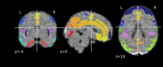
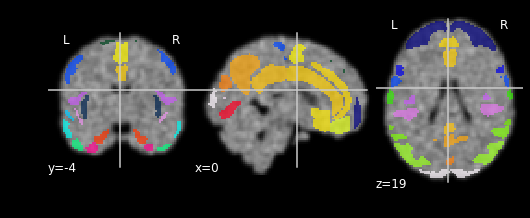
for each in images[:3]:
npl.plot_roi(atlas_fp, bg_img=each)

Collecting the ROI values
roistats.collect module has a function roistats_from_maps(images, atlas_fp)
which takes a set (images) of images (their file paths) and atlas_fp, the
path to a ROI volume (i.e. a volume with integer labels defining areas of
interest [and 0 elsewhere]). All images should be coregistered in the same
space (e.g. MNI). The ROI volume may thus come from an atlas, as the ones
from the nilearn.datasets
module.
from roistats import collect
import numpy as np

# Here we collect the mean value from each ROI on every image
res = collect.roistats_from_maps(images, atlas_fp,
                                 func=np.mean,
                                 subjects=images,
                                 n_jobs=8)
The created table will have as many columns as there are ROI labels. We may rename them with the corresponding names from the atlas.
# Get label names from Harvard Oxford atlas
from nilearn import datasets

name = 'cort-maxprob-thr50-2mm'
labels = datasets.fetch_atlas_harvard_oxford(name)['labels']

# Store them in a dict
labels = dict(enumerate(labels))
df = df.rename(columns=labels)
| Background | Frontal Pole | Insular Cortex | Superior Frontal Gyrus | Middle Frontal Gyrus | |
|---|---|---|---|---|---|
| subject | |||||
| /tmp/tmp_9rh_8p3.nii.gz | 0.10316 | 0.465694 | 0.503227 | 0.495352 | 0.475365 |
| /tmp/tmpqht6np22.nii.gz | 0.103357 | 0.471021 | 0.498914 | 0.488398 | 0.478122 |
| /tmp/tmpk0117ahy.nii.gz | 0.103379 | 0.470353 | 0.497508 | 0.494957 | 0.490264 |
| /tmp/tmpq6pnpx0r.nii.gz | 0.103438 | 0.46967 | 0.507529 | 0.49202 | 0.47704 |
| /tmp/tmpm2un1_ri.nii.gz | 0.103383 | 0.471193 | 0.501927 | 0.491835 | 0.474059 |
Plotting the data
roistats comes with a module plotting intended for visualizing tabular data
(built on top of seaborn/matplotlib)
with some predefined functions for boxplots, scatter plots with linear model fits
or histograms, with the possibility to account for covariates (using
inline linear regressions). The same function hence takes the data, computes
some version corrected for given covariates and plots it in some different possible
ways.
To recreate some kind of realistic case, let us add some totally random covariates to these previously extracted ROI values. Random "group", random age, random sex, random APOE E4 status.
# Let us add some totally random covariates

df['group'] = df.index
df['group'] = df.apply (lambda row: int(row['group'] > len(df)/2) + 1, axis=1)
df['age'] = df.apply (lambda row: random.random() * 5 + 50, axis=1)
df['sex'] = df.apply (lambda row: random.choice(['male', 'female']), axis=1)
df['apoee4'] = df.apply (lambda row: random.choice(['HO', 'HT', 'NC']), axis=1)
df['index'] = df.index

# How do they look
covariates = ['group', 'age', 'sex', 'apoee4']
df[covariates].head()
| group | age | sex | apoee4 | |
|---|---|---|---|---|
| 0 | 1 | 53.620190 | female | NC |
| 1 | 1 | 53.531222 | female | NC |
| 2 | 1 | 51.073742 | female | NC |
| 3 | 1 | 54.184375 | male | HT |
| 4 | 1 | 52.552064 | female | HT |
We will now plot the mean values from any given region (say the temporal pole but could be any other one). Importantly, we want to account for the potential influence of the covariates we just added (e.g. differences between men/women, effect of age, influence of APOE status).
For instance, let us look at the effect of the APOE status on the mean intensities taken in the Temporal Pole (across these 50 maps), accounting for the effect of age, sex and "group".
plotting has a method called boxplot for this.
from roistats import plotting
region = 'Temporal Pole'

# Plot data from this region
# Do it *accounting for covariates*
_ = plotting.boxplot(region, data=df, by='apoee4',
                     covariates=['age', 'sex', 'group'],
                     palette='default')
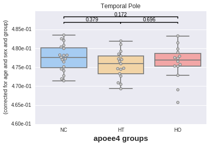
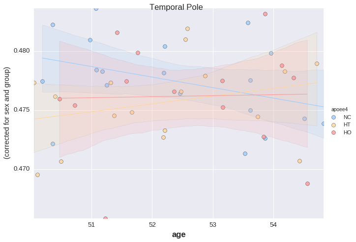
The plot displays the p values of two-sample t tests between each pair of categories, here APOE groups. No significant difference is found in any case (which makes sense considering the data comes from the same random process).
Same thing now with sex differences.
# Now by sex
_ = plotting.boxplot(region, data=df, by='sex',
                     covariates=['age', 'group'],
                     palette='default')
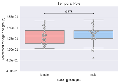
Still no significant difference.
Let us now look at age x APOE interaction, corrected for sex and "group".
plotting has a method called lmplot for this.
_ = plotting.lmplot(y=region, x='age', data=df,
                    order=1,
                    covariates=['sex', 'group'],
                    hue='apoee4',
                    palette='default',
                    s=50)
For the last example, the table needs to be reshaped a bit ("unpivot"). This is done to allow the use of large tables with many rows (and a moderate number of columns).
# For this last one reshape the table a bit ("unpivot")
cov = df[['age', 'apoee4', 'sex']]
melt = pd.melt(df, id_vars='index',
               value_vars=labels.values(),
               var_name='region').set_index('index')
melt = melt.join(cov)
It would look like this:
# Only keep 5 regions for this example
regions = list(set(melt['region']))
melt = melt[melt['region'].isin(regions[10:15])]

# It looks like this
melt.head()
| region | value | age | apoee4 | sex | |
|---|---|---|---|---|---|
| 0 | Inferior Frontal Gyrus, pars triangularis | 0.458292 | 53.62019 | NC | female |
| 0 | Superior Parietal Lobule | 0.508143 | 53.62019 | NC | female |
| 0 | Frontal Orbital Cortex | 0.480872 | 53.62019 | NC | female |
| 0 | Central Opercular Cortex | 0.496808 | 53.62019 | NC | female |
| 0 | Supracalcarine Cortex | 0.487534 | 53.62019 | NC | female |
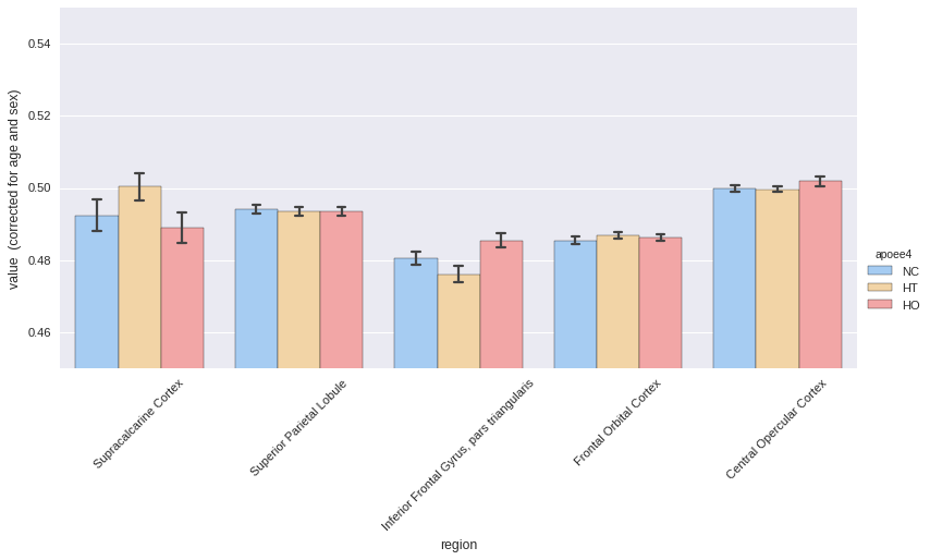
roistats.plotting has a method called hist to represent all the ROIs on a
single plot.
In this example, APOE status would be considered as the effect of interest, and age and sex as covariates.
_ = plotting.hist(melt, by='apoee4',
                  region_colname='region',
                  covariates=['age', 'sex'],
                  ylim=[0.45, 0.55],
                  aspect=2,
                  palette='default')
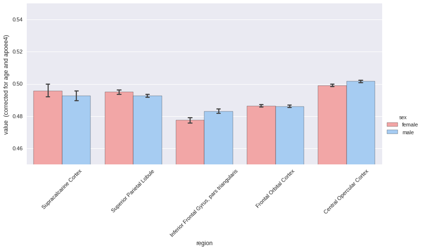
Now same thing with sex differences, correcting for age and APOE status.
# Again by sex
_ = plotting.hist(melt, by='sex',
                  region_colname='region',
                  covariates=['age', 'apoee4'],
                  ylim=[0.45, 0.55],
                  aspect=2,
                  palette='default')
roistats can be found at this URL.
For the context, I was working with diffusion-weighted imaging and myelin content to study the effect of age, sex and the APOE gene on microstructural properties of the white matter when I started to write this code.
This led to these two publications:
-
G. Operto, J.L. Molinuevo, R. Cacciaglia, C. Falcón, A. Brugulat-Serrat, M. Suárez-Calvet, O. Grau-Rivera, N. Bargalló, S. Morán, M. Esteller, J.D. Gispert for the ALFA Study, Interactive effect of age and APOE-ε4 allele load on white matter myelin content in cognitively normal middle-aged subjects, Neuroimage: Clinical, 2019
-
G. Operto, R. Cacciaglia, O. Grau-Rivera, C. Falcon, A. Brugulat-Serrat, P. Ródenas, R. Ramos, S. Morán, M. Esteller, N. Bargalló, J.L. Molinuevo, J.D. Gispert for the ALFA Study, White matter microstructure is altered in cognitively normal middle-aged APOE-ε4 homozygotes , Alzheimer’s Research & Therapy, 2018
Disclaimer: to date roistats is only
available as a raw (probably dirty) code but please open an issue if
making it available on package repositories may be useful to you and I
will make the effort.
Please let me know if you liked this post by clicking the button below.